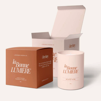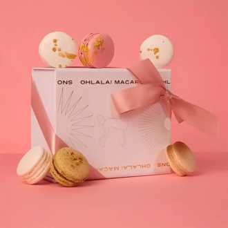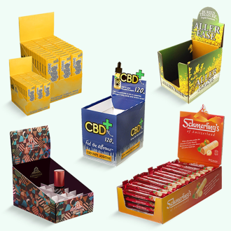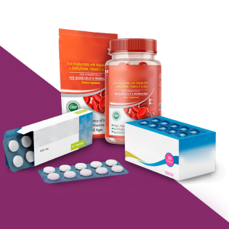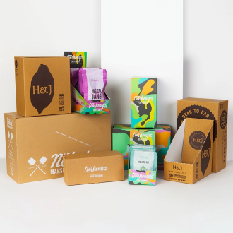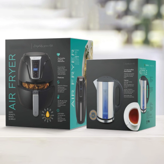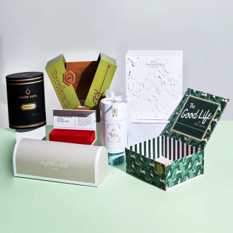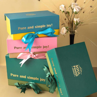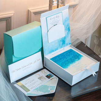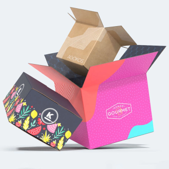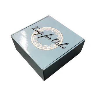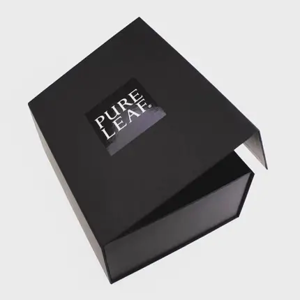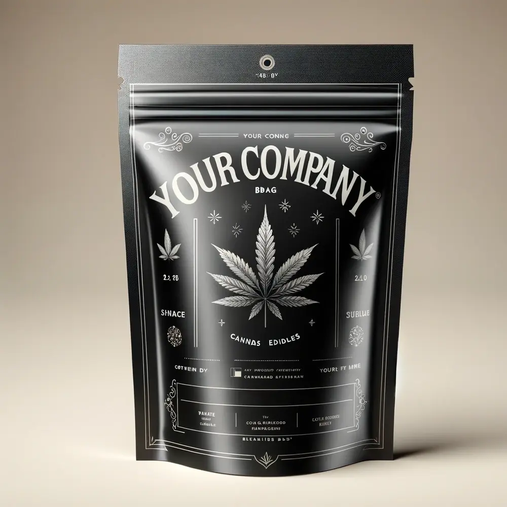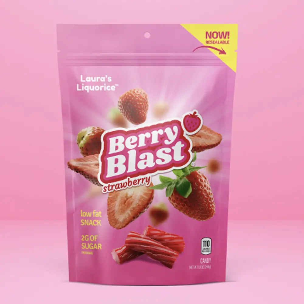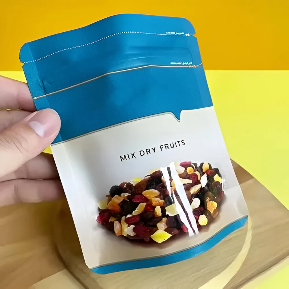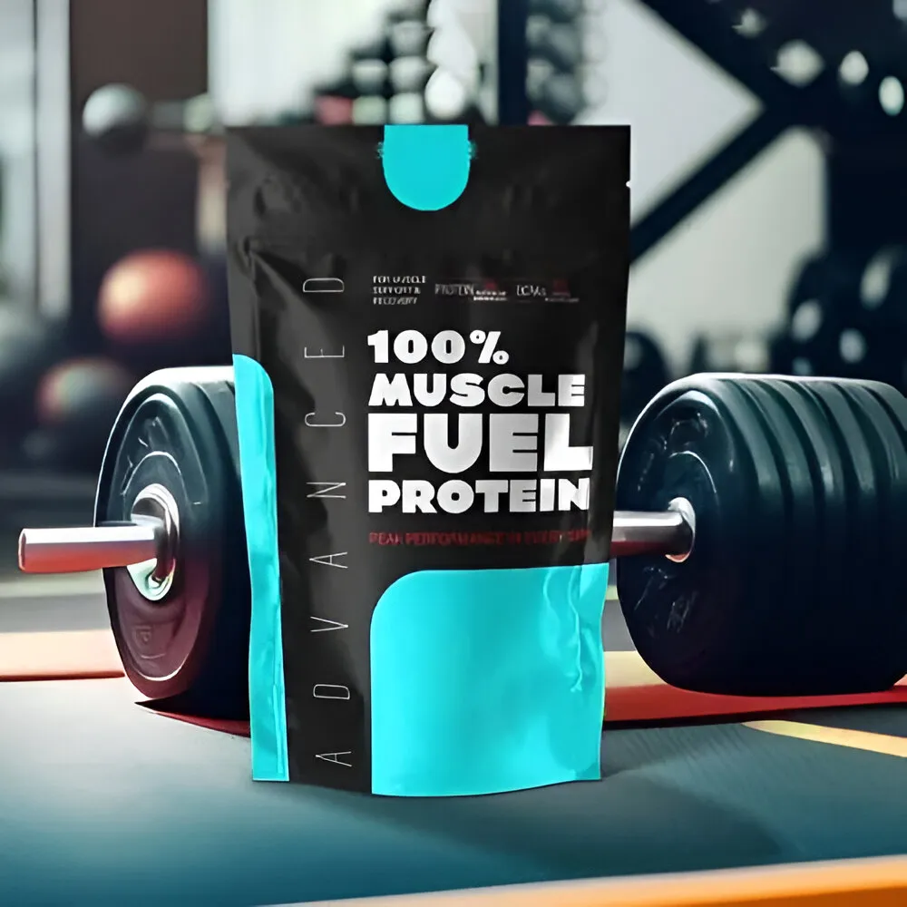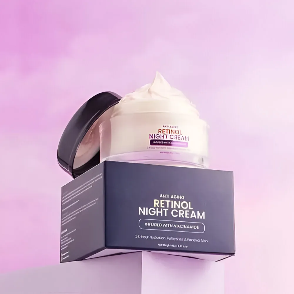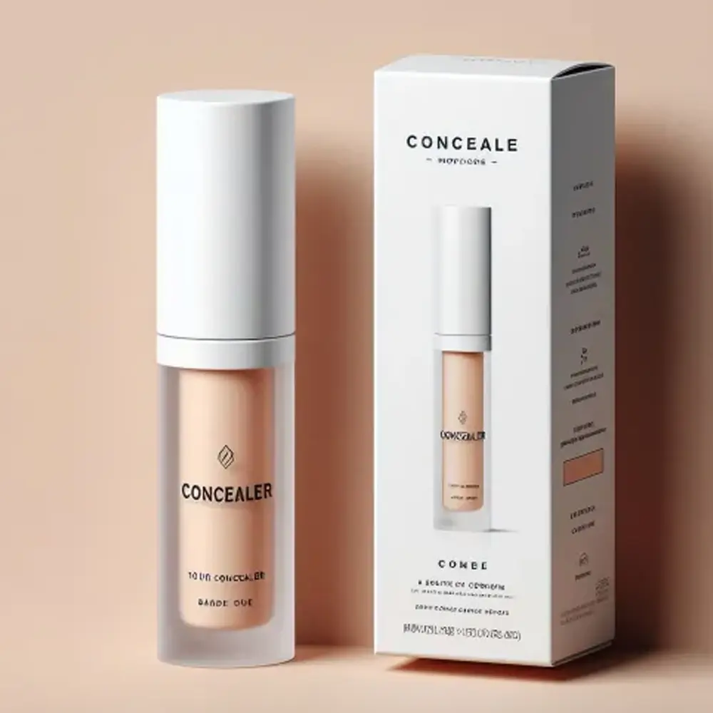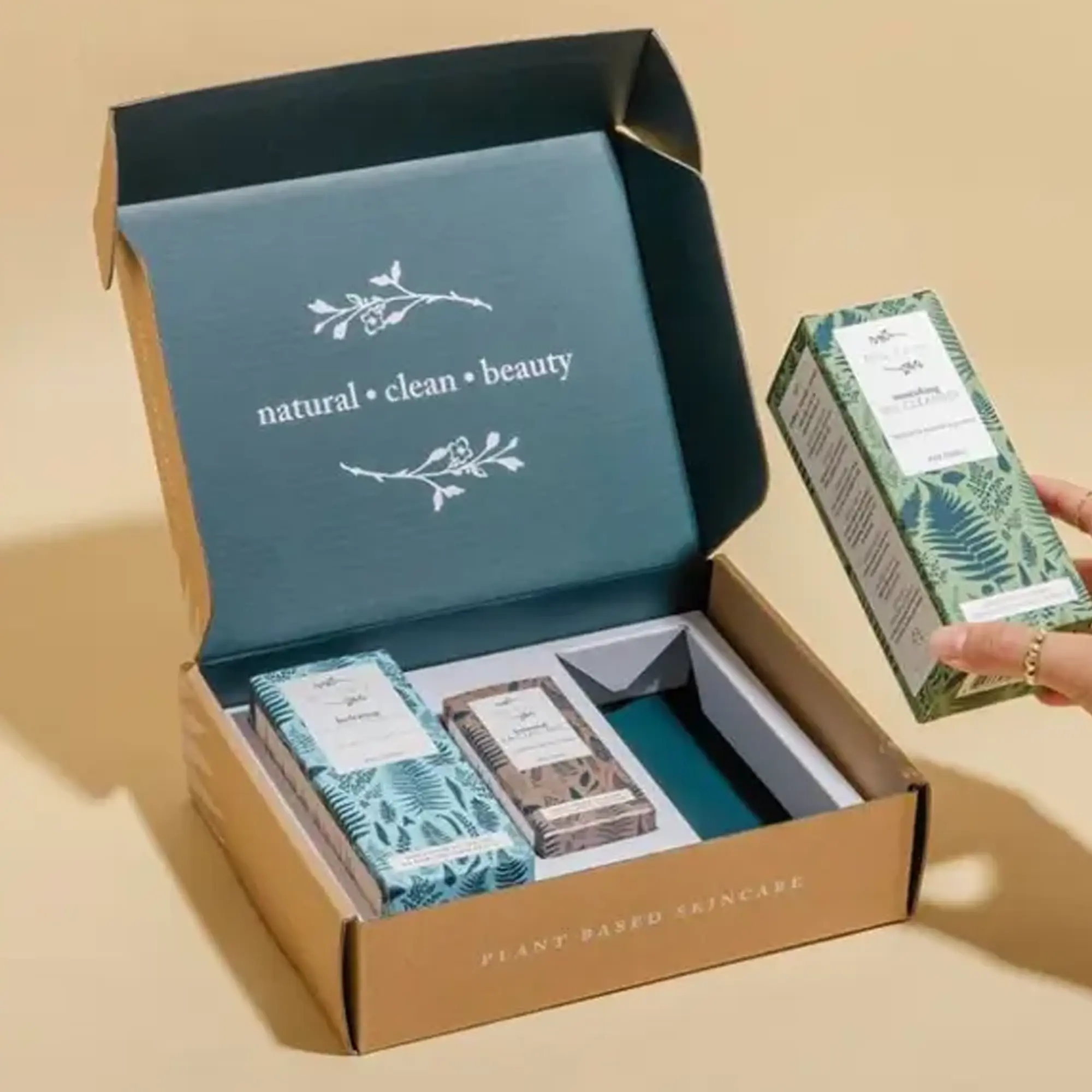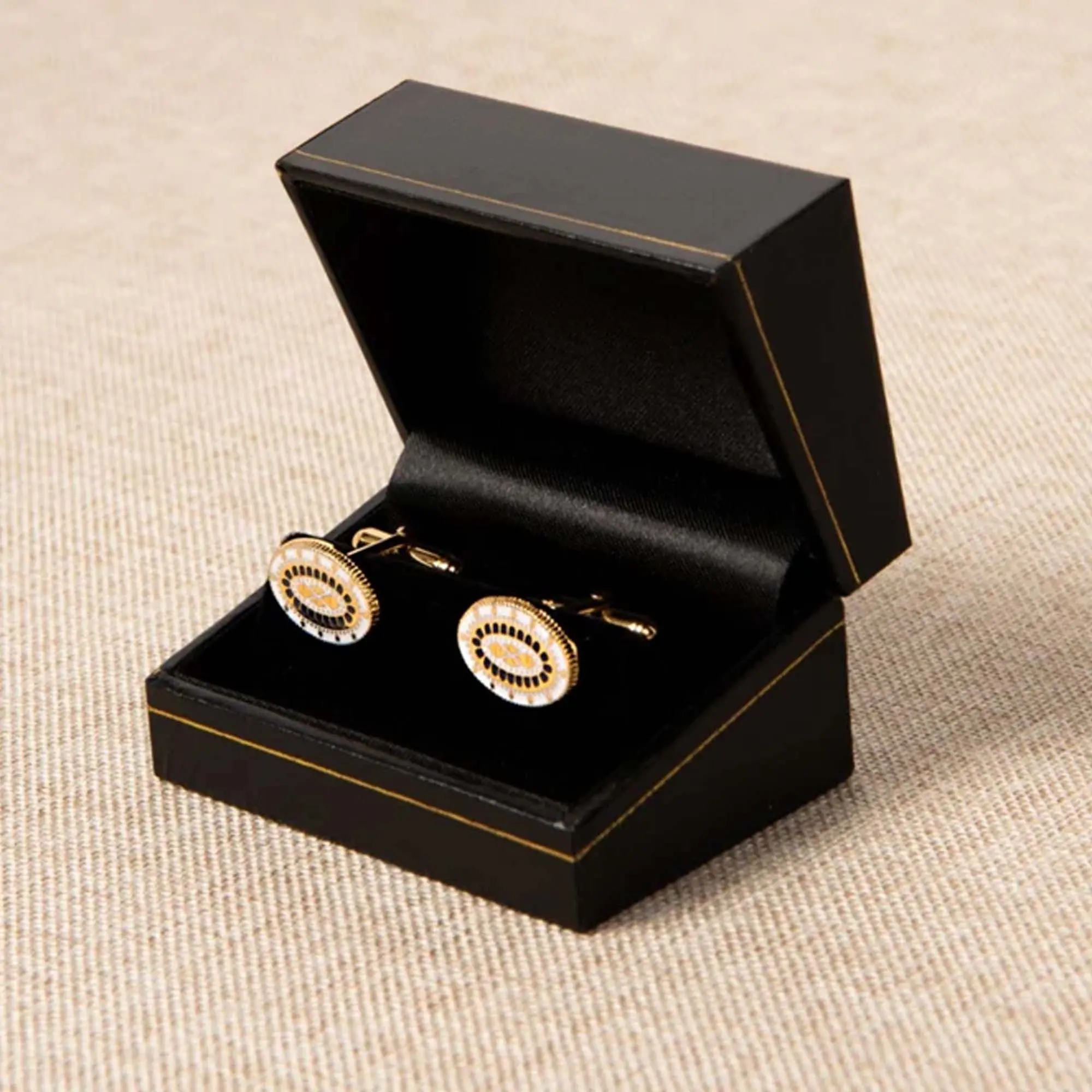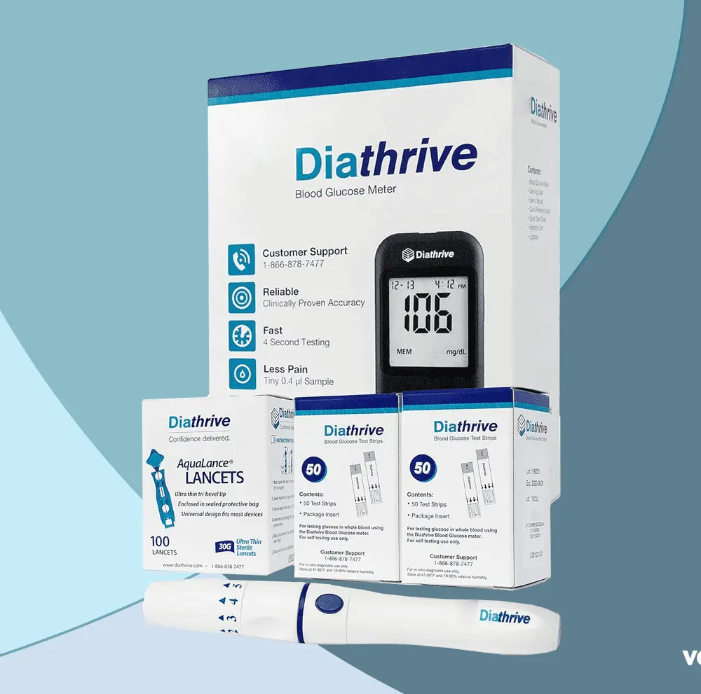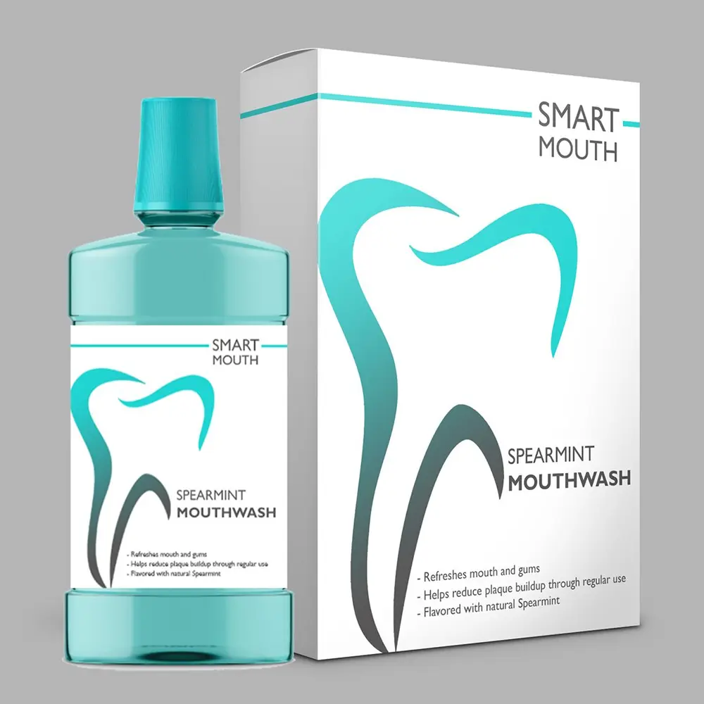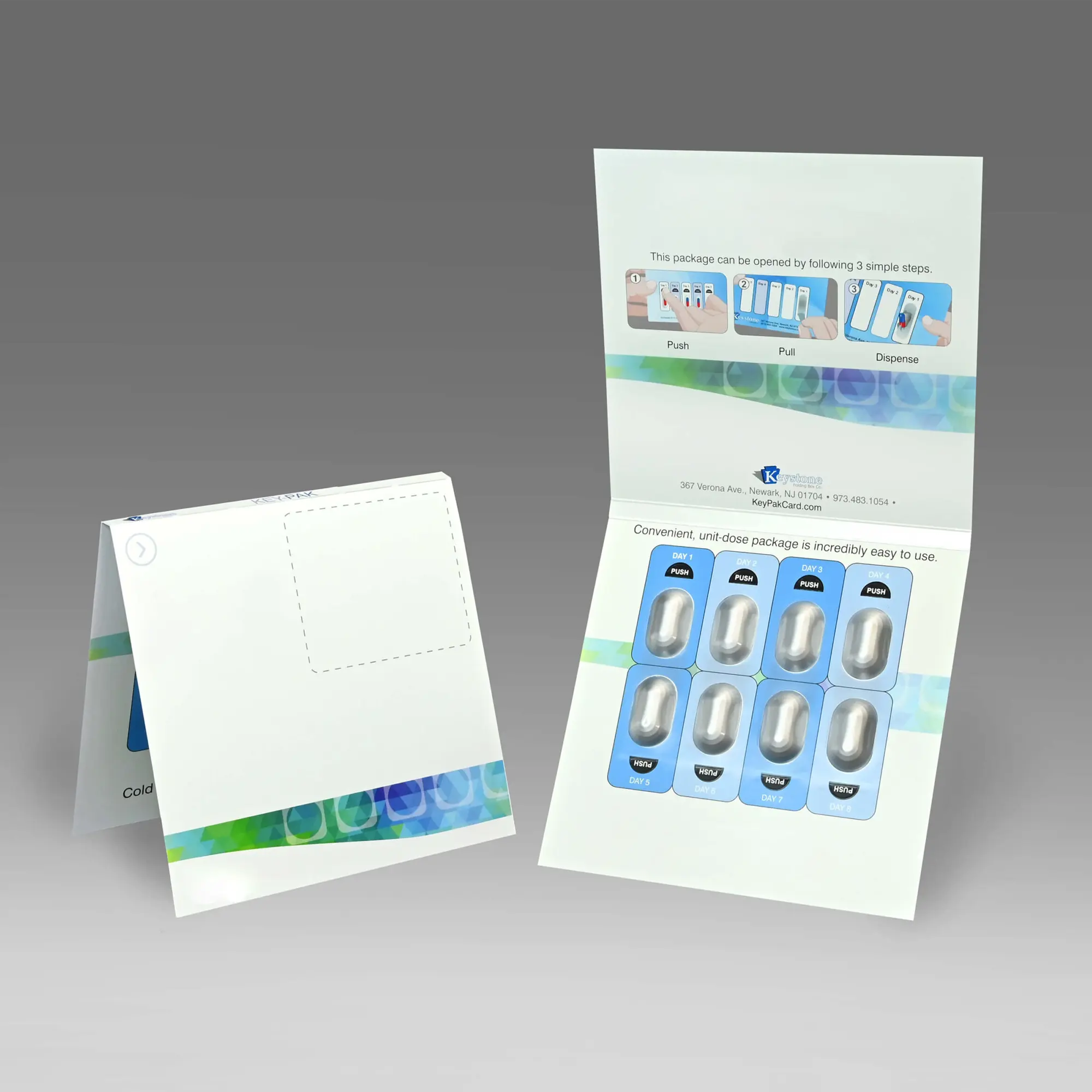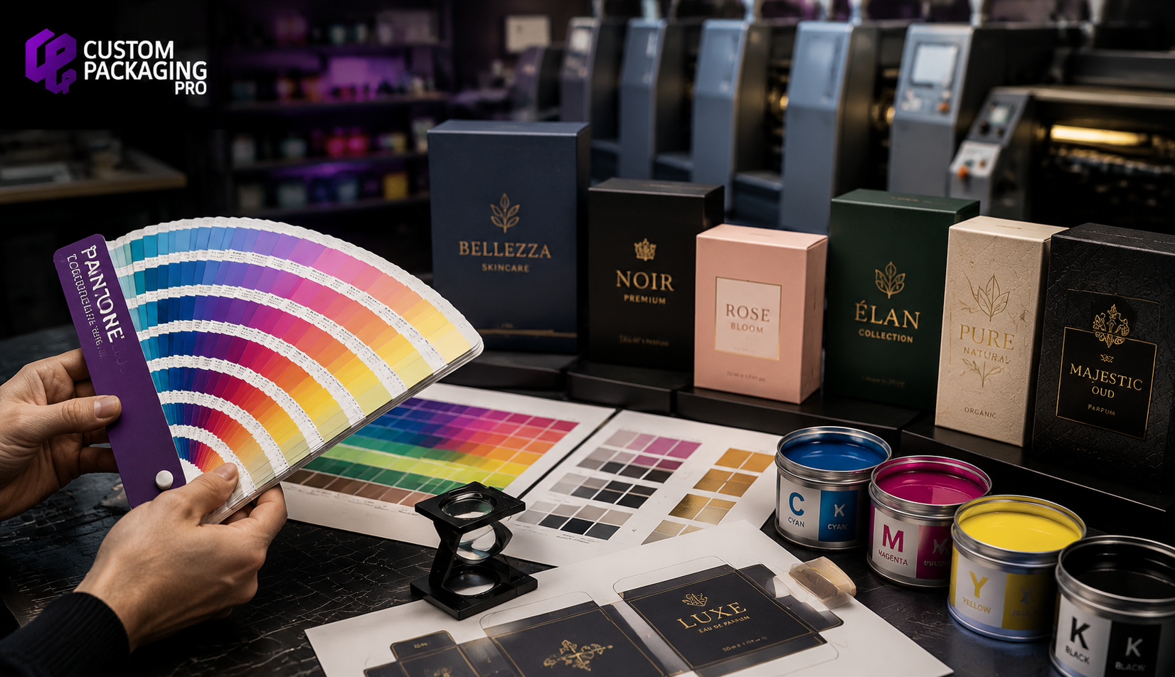
Color is one of the first things customers notice when they pick up a product. Before they read the label or explore the features, they subconsciously judge the product based on its appearance. For brands, this means that every shade, tone, and finish on a package contributes to customer perception. A slight variation in color may seem insignificant, but it can affect brand recognition and even influence purchasing decisions.
This is where the PMS color model becomes essential. Known as the Pantone Matching System, PMS is the global standard for achieving consistent, accurate colors across different printing materials and production runs. Whether you're producing luxury cosmetic boxes, premium food packaging, or custom retail packaging, PMS printing ensures your brand colors remain identical every time. In this guide, you'll learn what the Pantone Matching System is, how it differs from CMYK printing, why it matters in premium packaging, and when businesses should invest in PMS colors to strengthen their brand identity.
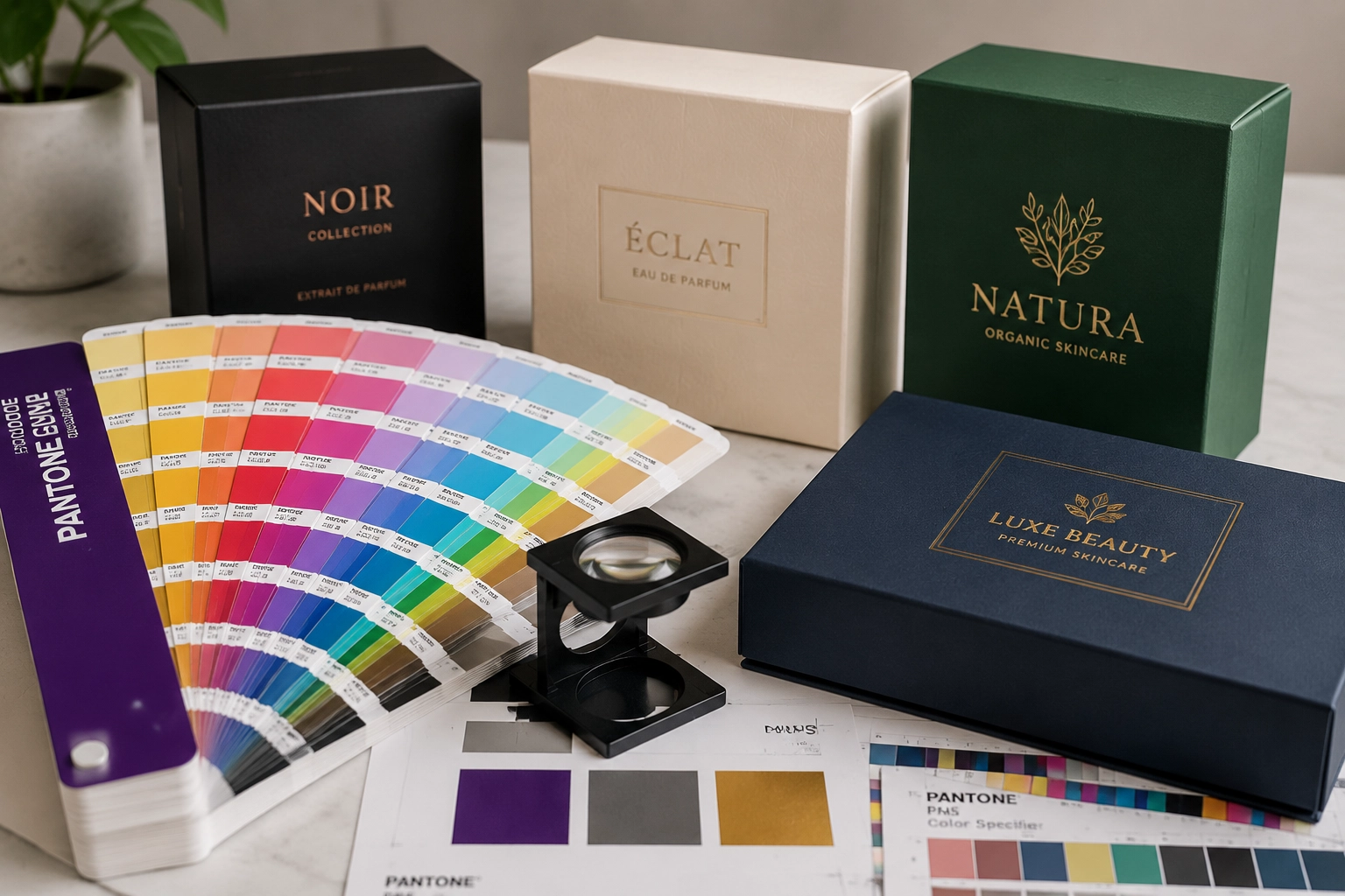
The Pantone Matching System (PMS) is a globally recognized color standard developed to ensure precise and consistent color reproduction across different printers, materials, and production facilities. Instead of creating colors by combining multiple inks during the printing process, PMS uses pre-mixed custom ink formulas, commonly known as spot colors. Each Pantone shade has a unique identification code, allowing printers around the world to reproduce the exact same color with remarkable accuracy.
For packaging brands, this level of consistency is invaluable. Whether you're printing a few hundred custom boxes or producing large-scale packaging for multiple markets, PMS ensures your brand colors remain identical from one print run to the next. This consistency strengthens brand recognition and gives customers a professional, high-quality impression every time they see your packaging.
Premium packaging is designed to communicate quality before customers even open the box. If colors appear faded, inconsistent, or different across product lines, it can weaken customer trust and reduce the perceived value of the product. Consistent color helps businesses:
Luxury brands understand that packaging is often the first physical interaction customers have with their products. A perfectly matched brand color reinforces professionalism and attention to detail.
Unlike traditional printing methods that create colors by combining cyan, magenta, yellow, and black inks, Pantone colors are mixed before the printing process begins. Each Pantone shade has its own unique formula. Printers simply order or prepare that exact ink rather than recreating the color every time. Because the ink itself is standardized, businesses receive highly predictable color reproduction regardless of:
Choosing the right printing method depends on your packaging goals, but PMS printing is often the preferred option when color accuracy is a priority. Businesses that invest heavily in branding rely on Pantone colors to ensure their packaging always reflects the same visual identity, regardless of where or when it is printed.

Although both printing methods have their place, choosing the right one depends on your packaging goals, production volume, and branding requirements.
| Feature | PMS (Pantone Matching System) | CMYK |
|---|---|---|
| Color Creation | Pre-mixed specialty inks | Mixes Cyan, Magenta, Yellow, and Black |
| Color Accuracy | Extremely precise | Can vary slightly between print runs |
| Brand Consistency | Excellent | Moderate |
| Best For | Logos, brand colors, premium packaging | Photographs and full-color artwork |
| Printing Cost | Higher | More economical |
| Special Colors | Metallic, fluorescent, custom shades | Limited |
| Retail Packaging | Ideal | Suitable for standard packaging |
PMS is the better option when:
CMYK works well when:
Many businesses actually combine both methods using PMS for logos and brand colors while printing product images in CMYK.
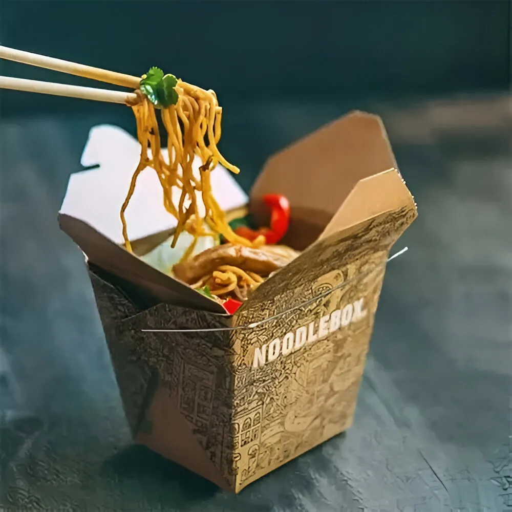
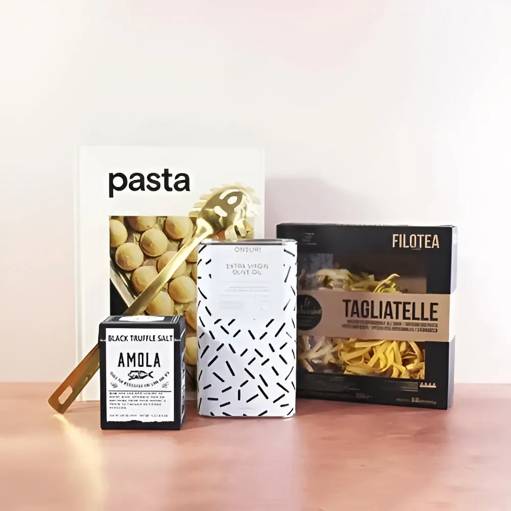
While almost any business can benefit from Pantone printing, certain industries rely on it more heavily because brand presentation directly influences purchasing decisions.
Selecting the right Pantone colors goes beyond personal preference. The chosen colors should reflect your brand personality and appeal to your target audience. Consider:
Testing colors on the actual packaging material is always recommended because paper texture and finish can slightly influence appearance.
Although Pantone inks are standardized, the final appearance can vary depending on the packaging substrate. For example:
Professional packaging manufacturers adjust printing methods to ensure the closest possible color match regardless of material.
Achieving accurate color reproduction starts long before the printing press. When submitting artwork for custom packaging, always provide your printer with the correct Pantone color code rather than relying on visual references alone. Pantone codes identify the exact ink formula needed to reproduce your brand color accurately.
For example, PMS 185 C is intended for coated paper, while PMS 185 U is designed for uncoated paper. Although the color number is the same, the final appearance can vary depending on the paper surface. Providing the correct Pantone code along with vector artwork ensures your printer can reproduce your brand colors consistently and avoid unnecessary revisions or production delays.
Many businesses unknowingly make packaging decisions that affect brand consistency. Common mistakes include:
Avoiding these mistakes helps create stronger and more recognizable packaging.
Creating premium packaging requires more than choosing attractive colors, it requires precision throughout the printing process. Custom Packaging Pro helps businesses achieve consistent, high-quality packaging by offering expert guidance on color selection, printing methods, and material compatibility.
Whether a brand requires Pantone color matching for luxury retail packaging or a combination of PMS and CMYK printing for complex artwork, experienced packaging specialists can recommend the most suitable approach. From selecting the right finishes to ensuring consistent results across multiple production runs, thoughtful packaging decisions help businesses maintain a professional image and strengthen long-term brand recognition.
Packaging printing continues to evolve alongside consumer expectations and manufacturing innovation. Emerging trends include:
These innovations will make premium packaging even more accurate and environmentally responsible in the coming years.
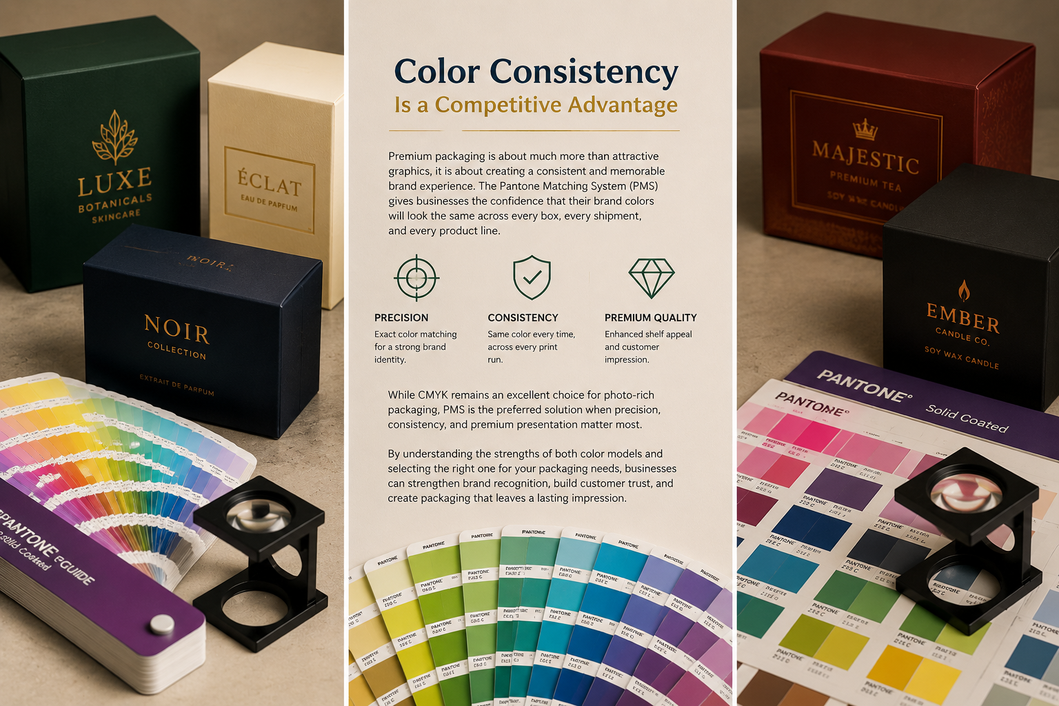
Premium packaging is about much more than attractive graphics, it is about creating a consistent and memorable brand experience. The Pantone Matching System (PMS) gives businesses the confidence that their brand colors will look the same across every box, every shipment, and every product line.
While CMYK remains an excellent choice for photo-rich packaging, PMS is the preferred solution when precision, consistency, and premium presentation matter most. By understanding the strengths of both color models and selecting the right one for your packaging needs, businesses can strengthen brand recognition, build customer trust, and create packaging that leaves a lasting impression.