December 02, 2020
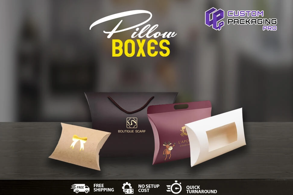
Standout Pillow Boxes for Standout Results
Both marketing and real life are completely two different things. For instance, in the real life, we wouldn’t say it’s all about the looks. However, when we are talking about the market, that’s totally different in many ways. Brands need to set an impression that is influential and impactful. Moreover, they are only going to get very short time for that. Say about 5-7 seconds to make that impression. But in saying that, it can be either bad or good. That is up to the Pillow Boxes they have designed for their product.
If you think about it, 5-7 seconds is not a lot of time. Especially when brands are up against a fierce competition. When you look at the stats this way, brands usually get a single shot at making that impression that needs to be both appealing and attractive in order to grab the attention of the buyers. Only then will brands be able to turn the customers into potential sales. Given this particular factor alone, brands should know that their packaging itself is the key variant that is going to make all the difference. But often brands are not able to make that right impact. It’s because they mess around a lot of things with their packaging. And this in turn makes the packaging a massive failure for the brand.
With that in mind, brands really need to focus on making their packaging design something that is an eye-pleaser for everyone looking at it.
Good Packaging That Is both Simple and Direct
We’ve all heard it quite a lot that simplicity will go a long way. Keeping that particular factor in mind, remember that no one will be attracted to a packaging design that yells out complexity or overly complicated access to the product. Remember that the world in the current times is already in a state of overstimulation. This state will make the people drawn quite easily toward any visuals that are highly simple and humble and will not require plenty of thought from the public. You have a product that will try to solve the problems and concerns of the consumers. Whatever solution your product is offering needs to be stated clearly on the packaging boxes. As soon as the buyers place their eyes on the boxes, they know what the product is, what it does and how they can make use of it.

Let the Packaging Speak for Itself
As much as we agree that a simple and humble packaging is highly needed and necessary. But in saying that, do not miss out that wow factor in your packaging design that will make the public go crazy for your goods. Well, here’s the reason why you need to focus on this factor. You have a product that is going to be sitting next to countless similar items up on the shelves. All of them will be vying for the consumer’s attention that are passing by.
When your packaging design is dull enough to not make them go wow, then here’s a sale that you’ve missed out on. That is why you need the design to be a standout. Just ensure there is nothing boring and sleepy about your packaging design. At the same time, don’t throw in too much to make it far too busy. You need to find the perfect balance between elegance, class and simplicity.
Great Packaging Can Tap into The Consumer’s Deepest Emotions and Feelings
You and I both will not realize the fact that nearly 80% of our purchasing decisions are solely and purely based on the emotions and feelings we hold dear to use. Usually we will make a decision when we feel that are emotions and feelings are being tapped into deeply and strongly. This is why it’s highly crucial for businesses to create the right kind of packaging that is going to allow the buyers to connect with their emotions and memories. Once the buyers set their eyes on the packaging, they should be able to feel like perhaps there is a sense of connection which is based on certain memories, emotions and feelings that are quite dear to them.
So how do you think you can make it possible? Well, we think the best way would be through eye contact. Think about it! When do you make eye contact with a person or something? When you are trying to make a point. When you try hard to make a kind of connection, it actually means something. And when you linger on further to this particular moment in hopes to perhaps find a meaning, it’s leading somewhere. You try all your best to understand this particular connection and what this means to you.
The packaging you have design for your product needs to do the same. The packaging should be able to make a strong and impacting impression on the consumers. As soon as the buyers look at the packaging, it should be able to make them pause for a moment and have a close look at the product. But within that moment, the packaging should be able to capture their feelings and emotions. Moreover, the product needs to be able to win the hearts of the buyers.
Ideally, you should think of incorporating colors, designs, shapes, styles and images to these packaging options. Because all these elements have the ability to elicit the feelings and emotions brands are trying hard to capture. This is the way brands will be able to win the hearts and souls of the consumers.

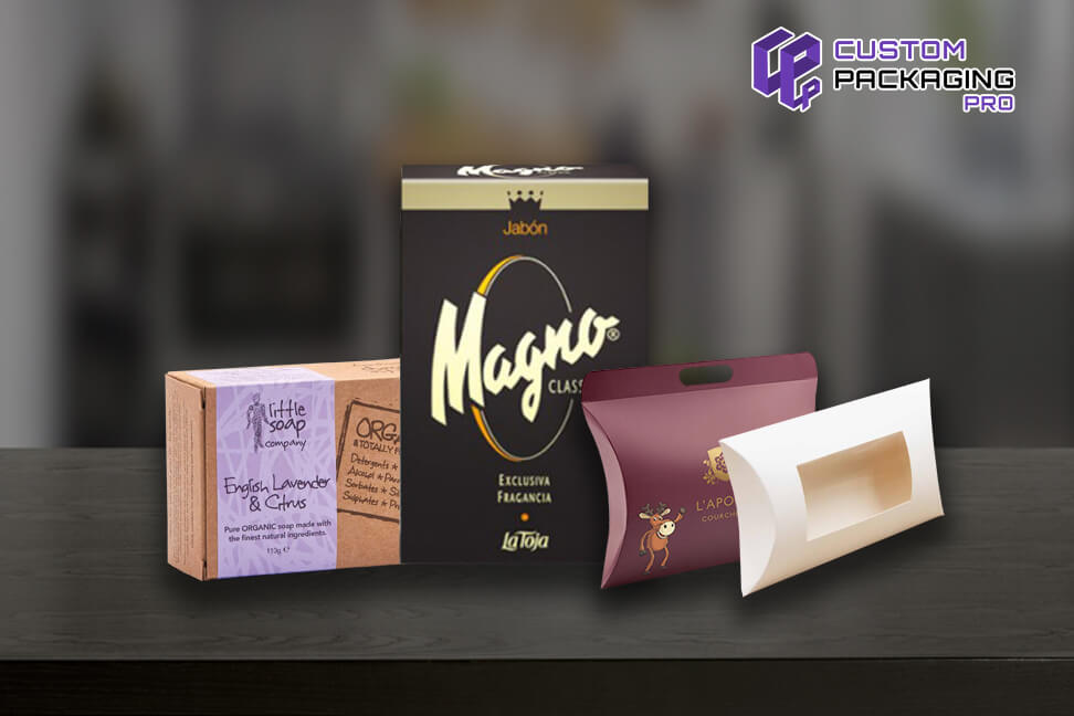
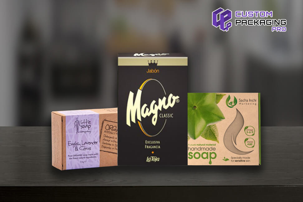
When brands incorporate certain colors in the Soap Boxes packaging design, these can elicit a number of specified emotions. For instance, people greatly adore babies or animals. But at the same time, these same people may be drawn to designs that are quite edgy, strong and mysterious. The main purpose of your product is going to dictate the emotions that need to be focused on.


