September 01, 2021
Custom Packaging – Fonts Making Massive Difference
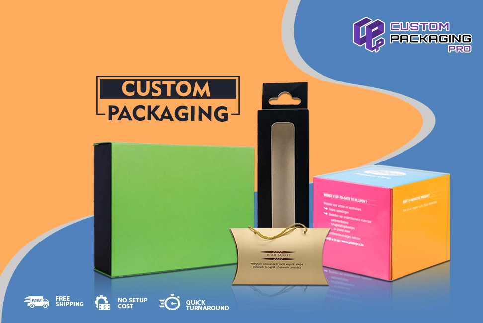
Font at times might seem like something unnoticeably small on the boxes, but even these items elements play a massive role in the success of the business and its sales. Yes, you heard us absolutely right. These tiny things will help you set your mark. When the font is not readable on the Custom Packaging, your sales and the overall look of the boxes will be badly impacted. You know your packaging has the potential of drawing the attention of your customers. Well, the font seems to be going the same thing.
These tiny things can at times be the difference makers for your packaging, and of course sales. In other words, you know your packaging has to be perfect in every way. Well, the font too will ensure this factor. With that, keep in mind the color, design, style, images, content to the font that you use on the choices need to be in perfect balance.
Custom Packaging Fonts That Can Change Everything for Businesses
You must think of things this way. Everything on the packaging is a representation of the brand and products. Different elements on the packaging are representing different characteristics and personality of the brand. With that, you need to go with a font that can match perfectly with the dynamic personality and persona of your business. This is the kind of thing that can make a really strong, bold, and impacting statement.
But this is not all. There are a number of ways in which fonts can impact businesses, the products being sold, number of sales, and the overall feel, look and appeal of the packaging options. You need to know what these could be. Let’s have a read to find out:
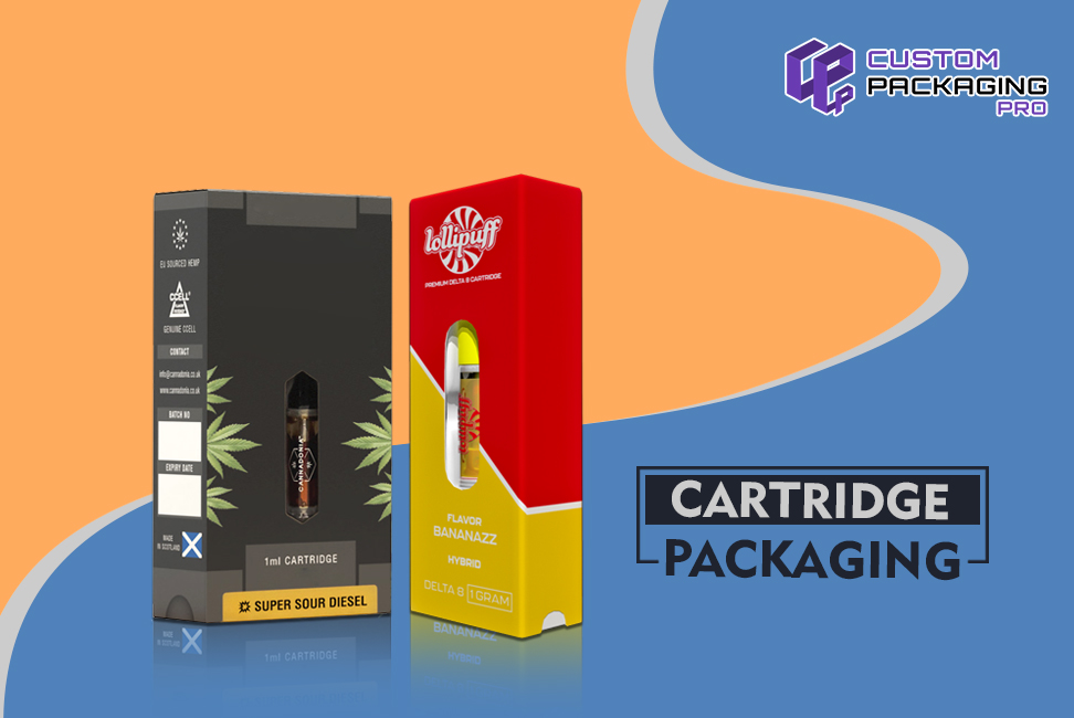
Fonts on Cartridge Packaging That Link a Kind of Association
With time passing by, a number of associations and links have been developed with the like of the fonts that are used on packaging. And if that’s not it, these fonts on the Cartridge Packaging do represent certain traits of the business personality.
Let’s dig a little deeper, shall we? When brands choose a font that can give a rather older typeface kind of feeling, or something that sends out the most classic vibes, it is giving the impression of the packaging being highly prestige. This is kind of a ritual that the companies or businesses are delivering for many years in the industry. However, when businesses choose a rather modern font for the purpose, this is going to add a hint of trendiness, cutting-edge and the choices being updated.
Don’t Overwhelm the Customers Even Accidentally
Sometimes brands tend to choose a lot of fonts for their packaging which can overwhelm the customers. There are just so many of them, the customers get confused. Brands must know this is a huge mistake they make on their part. While it is completely fine to go with more than one font, but when brands overdo something, that’s when things get out of hand. Overdoing things will always hurt the business. Which is why brands must try and stick to just a few.
For instance, if you really need to, it would be best you do not use more than three different styles and types of fonts. And this needs to be done only when you feel the design needs a little bit more lifting. However, when the design itself is quite striking and attractive, there is no need to pull such an idea. You must stick with one then. You must realize when you have a super impressive packaging box, you need to let it do its thing.
You mustn’t rely on the font to make sales or appeal to the customers. Moreover, this shouldn’t mean at all that you need to choose a font that can entirely disrupt the overall look of your packaging.
It is never a bad call to combine a couple of fonts. But then you must be able to do that correctly. However, whenever you feel you are in a fix when selecting between a font that is readable and one that you find attractive, you must go for the former one – every single time.
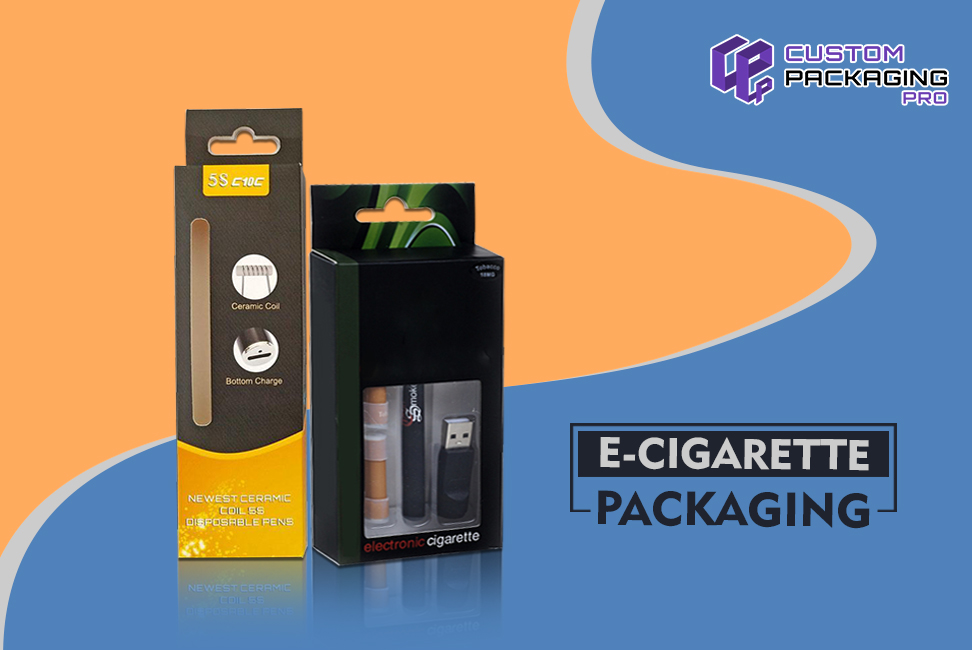
The Cardinal Error of Hiding Key Details and Information on E-Cigarette Packaging
When you select a font for your packaging options that is not readable, the customers will never be able to make out what is written on them. They will find it hard to understand the content and every single detail about the product. If there is one thing anyone would hate about a packaging design more than inaccurate and irrelevant information is not being able to make out what is written on the boxes.
So regardless of the content being perfect in every way, the information as accurate as it can get, if the font on your E-Cigarette Packaging isn’t readable, it means you are done for. Nothing is going to be worthy. It would be better if you do not put anything at all on the packaging.
Therefore, you need to be wise when you are selecting a font for your packaging. It should be something the customers can easily read. The customers are eager to know what products do for them and how these can help them. Only when brands choose a readable font for the packaging, the customers will not only know what is inside but they will also be able to know everything about it.
In short, when you use the right font for your packaging, you should know you will be able to make a massive impact on the audience with your packaging design. This ultimately leads to an increase in sales. Which is why you must choose wisely. You need to make a decision that is going to favor your business.


