December 11, 2019
Custom Cosmetic Boxes – Creating the Perfect Packaging
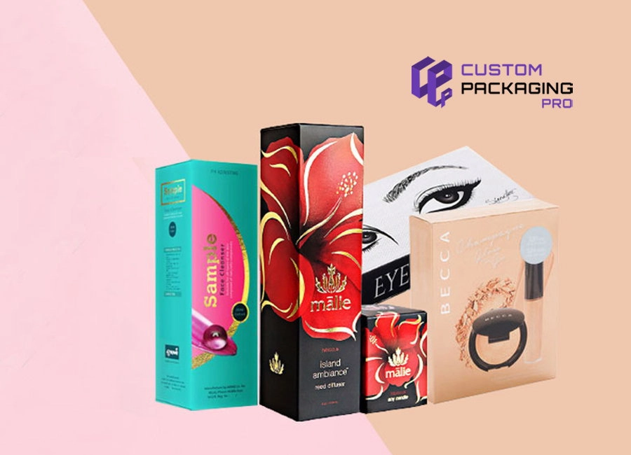
Feeling inspired about creating the most perfect custom cosmetic boxes and packaging? The right way to start with is the design. It’s best that you set the standards of your brand’s design. But first, setting your elements of design for your brand’s packaging is a better option.
To get started, how about you consider the following:
Style of Cosmetic Boxes
Okay, so you’re thinking about your product’s packaging. Well, here’s how you should get started. You first need to start with bringing to your packaging a personality and mood. What should be, how should it be? What’s it going to be like? Are you thinking maybe a minimalist vibe when it comes to your design? Or maybe you’re thinking about those more stylized and over-the-top designs?
Think about that custom box design and packaging design that you wish to move towards. This will definitely benefit you in leading the remaining design yet ensuring that your packaging decisions that you are making are in line with the design’s overall goals.
Once you have locked in the style, this will help you incredibly in determining any additional designing elements that you should or need to consider. Is it going to be one of those pop art feels? If yes, then there’s probably some illustration that needs to be done to lead the whole designing process. Or what about incorporating some natural elements because your cosmetic brand is also ‘Natural’. If so, you can add in some images of nature to your packaging design. Where we’re trying to head with this is the kind of style you are looking for will help you in adding all those design elements to get that style and feel to come across the entire packaging.
Colors
When you are about to choose colors for your packaging, these are the things you need to do;
- Choosing a color that will blend perfectly with the personality of your brand.
- Choosing a color that will immediately grab the attention of your customers.
- Choosing a color that makes your product a standout in the fierce competition you are up against.
But the point where we are heading now is the most important one, because we are dealing with the most uber-competitive industry here – the world of cosmetics and beauty!
You need to choose the color palette of your brand just like you would assemble this season’s eye shadow palette that you believe you must have. Bottom line, staying true to your brand is what we are asking here, while still trying to differentiate you from your competition.
Take it like this for say. In this world of beauty and cosmetics, pink is a widely popular color. The color is fun, its feminine. But the main thing, it’s one of those colors that is being widely used in this glitz and glorious cosmetic world. We put this color mostly on our faces too.
But here’s the thing. Choosing pink because it is widely popular won’t make things less easy for you. In other words, it can be a big mistake you might be making. Exactly how? Let’s get to the point then. You choose a packaging of pink to be stacked up in a cosmetic shop that is already a sea of pink. How will you even get noticed? Can you seriously grab the attention of your customer?
If you have a look at the most recognized cosmetics and beauty brands, you will notice they use colors as the perfect way to build up their company. For instance, thinking of purple would instantly pop Urban Decay in the head. White and bold black is something Make up forever owns.
So you want your brand to be successful too? You just need to be on the same path as these brands. Find your brand a good color palette that will not only help your products pop out on those shelves, but it should become synonymous instantly with your brand.
Fonts
The next thing up is fonts. When it comes to colors, you want something different, something unique for the brand. The goal of that is be recognized instantly when your customers have a look at your packaging. Moreover, the colors you choose will easily make you to stop when the customers scan the shelves loaded with goods. But common, it cannot be the same thing fonts. Choosing fonts that are not readable is a big mistake.
So you want to go with a classic feel, we get that. But it’s not wise to follow the cliché. You need to stick with something that is elegant, something that is readable, something that will get you noticed. Take Clinique for instance. It uses the old classic yet elegant Serif font. Highly noticeable for them, easily read.
But that doesn’t mean you need the same font too for your brand. Think about your packaging, and how the font would look on that. Then choose a font. It’s best you check first and shortlist all those fonts that are going well with the packaging. But at the end of the day, the fonts that you list out should be easy to read and clear. Even in the teeny tiny form, you can make it out easily what’s written on your custom printed boxes wholesale.


