By Rai Haider
March 20, 2020
10 trends to follow for cereal boxes
In the highly dynamic and saturated retail food sector, product presentation is just as critical to commercial success as the quality of the food itself. If your company relies on off-the-shelf, generic boxing solutions, you are actively losing ground to forward-thinking competitors who leverage specialized packaging strategies. Custom containers do far more than merely hold breakfast grains or rest passively on supermarket shelves.
Tailored packaging operates as an active, 24/7 silent salesperson, extends product shelf life, protects delicate foodstuffs during long-distance transit, and cements brand equity in the minds of consumers. Continuing to rely on uninspired, standard packaging severely restricts your market reach. Transitioning to dedicated cereal boxes enables you to capitalize on modern consumer purchasing habits, maximize visual impact on retail displays, and drive measurable, long-term sales growth.
Capturing buyer attention in a crowded grocery store aisle requires significantly more than applying bright colors; it demands a strategic alignment of structural engineering, material selection, target demographic research, and consumer psychology.
Decision-making at the retail shelf often takes place in milliseconds, driven predominantly by visual hierarchy, perceived value, and brand trust. By executing well-researched, forward-thinking packaging concepts, breakfast food manufacturers can establish instant trust, communicate vital nutritional benefits, and create an unforgettable unboxing experience in home kitchens. Below is a comprehensive, deep-dive examination of the key trends, manufacturing considerations, and design strategies shaping the modern food packaging industry.
Key Trends, Manufacturing Considerations, and Design Strategies
Implement Smart Packaging and Interactive Technology
Technology integration has rapidly evolved from a novel gimmick into a core standard for modern consumer packaged goods (CPG) marketing. Today’s connected shoppers demand instant access to product origins, digital engagement, and total supply chain transparency. By incorporating scannable elements directly onto paperboard surfaces, food brands can seamlessly bridge the physical box with interactive online touchpoints.
- Dynamic QR Codes and Interactive Customer Engagement
While standard Universal Product Code (UPC) barcodes remain essential for checkout point-of-sale scanning and stock control, dynamic 2D barcodes and Quick Response (QR) codes offer unprecedented brand engagement possibilities.
Placing clear, inviting scannable codes on side or rear packaging panels allows consumers to quickly scan the box using any smartphone camera. This instantly directs them to rich digital experiences, such as interactive farm-to-table ingredient tracking, behind-the-scenes video recipes, promotional mini-games for children, or digital loyalty reward sign-ups. By offering digital value directly from the physical container, your brand deepens customer loyalty without cluttering the main artwork panel.
- Smart Chips and Temperature-Sensitive Indicators
For premium or organic product lines, advanced smart packaging utilizes Near Field Communication (NFC) tags or temperature-sensitive indicators. These technological inclusions verify product authenticity, prevent counterfeiting, ensure tamper-evident security, and notify supply chain managers or store clerks if humidity levels inside the package have been compromised. Implementing smart technologies signals an uncompromising dedication to food safety and premium quality control.
Connect Through Emotional Resonance and Brand Storytelling
Consumer purchasing behavior is heavily guided by emotional drivers rather than purely logical evaluations. In the breakfast food category, consumers frequently look for comfort, family togetherness, childhood nostalgia, or wellness assurances. Packaging designs that actively evoke positive feelings consistently outperform text-heavy, strictly informational designs on crowded retail displays.
- Evoking Family Warmth, Joy, and Wholesome Health
Breakfast foods are deeply tied to morning routines, family bonding, and comforting memories. Packaging artwork that utilizes warm color palettes, friendly characters, and wholesome imagery subconsciously signals warmth and nourishment. Incorporating high-definition lifestyle photography or charming custom illustrations helps communicate the simple joy of sharing a nutritious morning meal with family. Emotional clarity creates a powerful psychological connection that influences repeat purchases.
- Communicating Nutritional Milestones with Visual Clarity
Today’s health-conscious shoppers regularly audit product packaging for organic certifications, non-GMO badges, high fiber content, and low sugar levels. Rather than burying these details in dense blocks of small text, employ clean iconography, distinct certification seals, and strong typographic hierarchy to showcase key health claims. Instantly highlighting nutritional benefits provides immediate reassurance to busy parents and health-minded shoppers alike.
Leverage Heritage Appeal with Vintage and Retro Aesthetics
Retro design trends represent a powerful, enduring aesthetic that crosses generational divides. Nostalgic artwork taps into fond memories for older demographics while offering a distinct, authentic, and fashionable appearance for younger shoppers looking for artisanal charm over corporate mass production.
- Mid-Century Typography and Muted Color Palettes
Incorporating mid-20th-century design choices—such as hand-drawn mascot art, classic serif fonts, and muted pastel or solid matte tones—endows your product with an established, trusted heritage feel. Replicating classic design elements from the 1950s through the 1980s projects time-tested reliability and careful craftsmanship. This vintage presentation offers a striking contrast to the hyper-glossy, synthetic designs prevalent on modern grocery shelves.
- Attracting Gen Z and Millennial Buyers Through Retro Styling
Younger demographics who did not experience mid-century grocery stores are drawn to vintage styling because they associate it with authenticity and quality craftsmanship. In a retail world dominated by digital screens and uniform corporate design, physical packages featuring vintage letterpress styles, classic textures, and nostalgic cartoon mascots feel personal, tangible, and highly shareable on social media platforms.
Ensure Total Labeling Accuracy and Regulatory Compliance
Packaging audits reveal that a significant number of commercial products enter retail distribution with ambiguous, hard-to-read, or poorly placed product labels. Clear, precise labeling is far more than a regulatory obligation; it is a foundational pillar of building brand credibility and consumer confidence.
- Eliminating Buyer Friction Through Clean Typography
Hard-to-read ingredient lists, hidden allergen warnings, or cluttered nutritional tables cause immediate buyer hesitation. Ensuring that all legally required information—including net weight, serving breakdowns, calorie values, and manufacturer contact info—is printed in high-contrast, clean, perfectly readable fonts eliminates friction at the point of sale. Partnering with experienced industrial printers guarantees sharp text execution and zero registration blur across massive production runs.
- Building Consumer Trust via Complete Ingredient Transparency
Modern shoppers expect complete honesty regarding what they put into their bodies. Prominently featuring natural ingredients, zero artificial preservatives, or clear allergen-free facility badges directly addresses dietary sensitivities. Transparency builds lasting trust, converting casual first-time shoppers into lifelong brand advocates.
Incorporate Transparent Die-Cut Windows
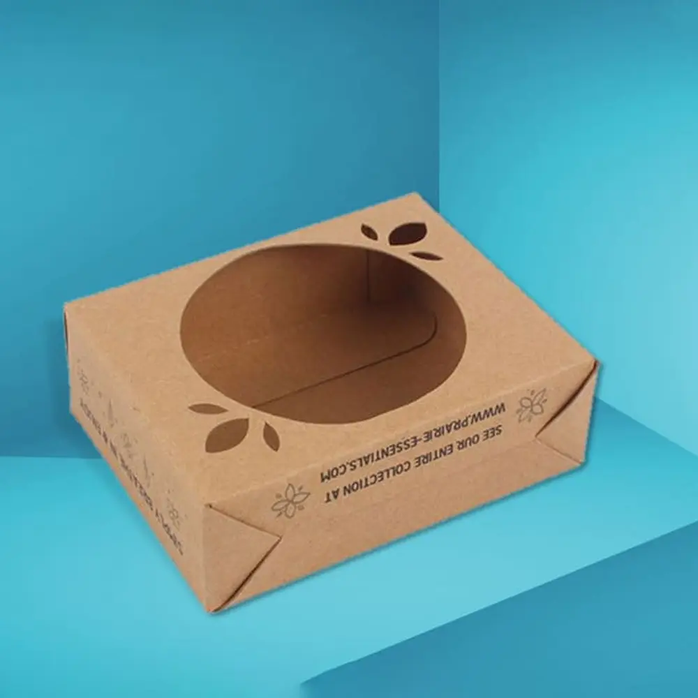
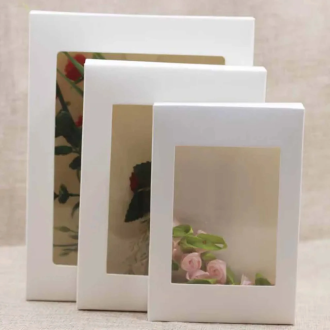
Seeing the physical product before buying creates immediate consumer reassurance. While traditional paperboard cereal boxes completely hide their contents, introducing transparent window cut-outs builds immediate credibility by allowing buyers to evaluate the color, size, and freshness of the cereal inside.
- Custom Die-Cut Window Designs
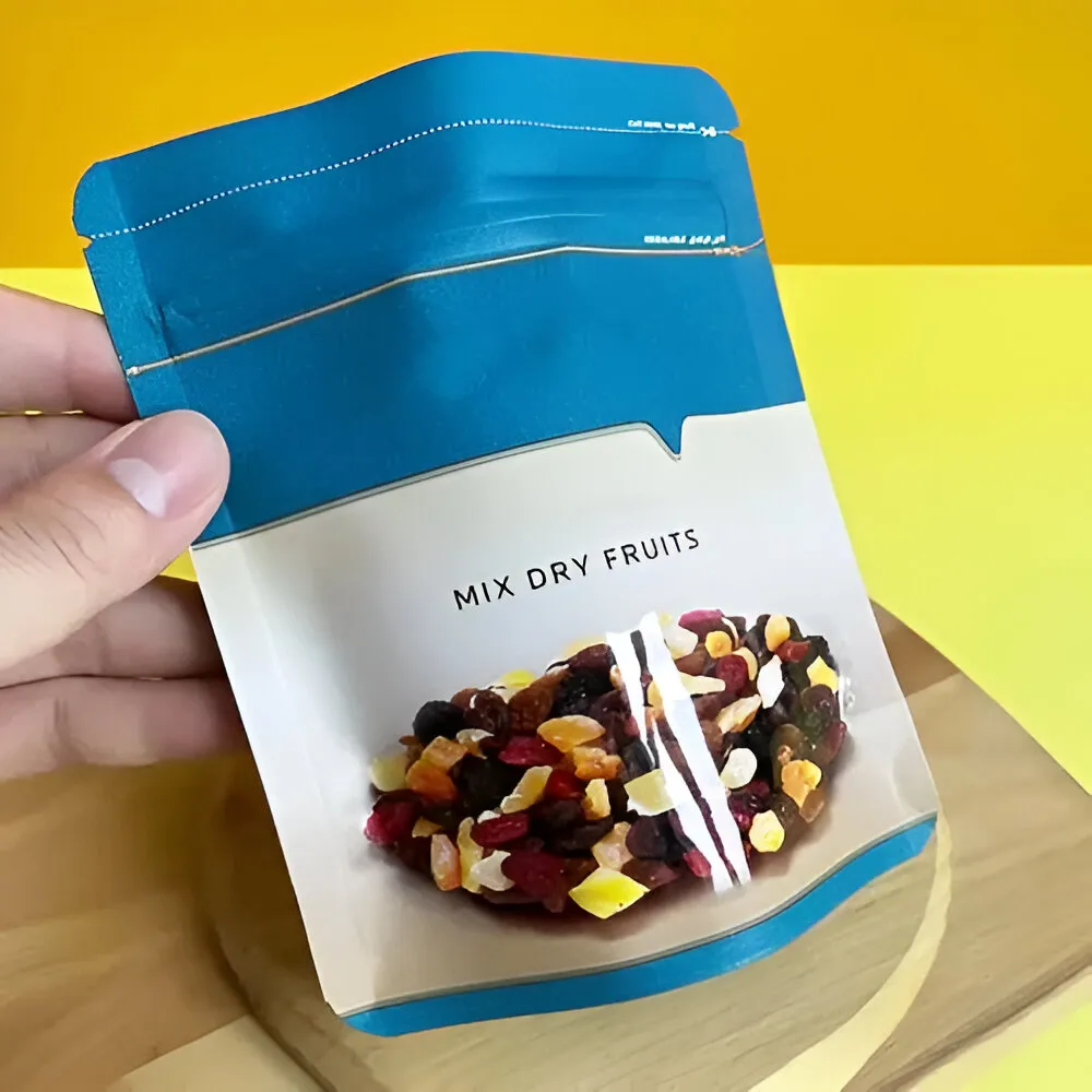
Integrating precision die-cut windows on the front panel—lined with food-safe clear film—allows consumers to see the quality of the grains, clusters, or dried fruit additions prior to purchase. Custom-shaped windows (such as a cereal bowl silhouette, a mascot’s mouth, or an outline of your brand logo) serve both a functional window purpose and an engaging visual design element.
- Stimulating Visual Appetite to Drive Impulse Purchases
When consumers can see crisp flakes, rich cocoa clusters, or vibrant berry slices, it stimulates their physical appetite response directly. This immediate sensory connection significantly boosts impulse buying behavior, giving your brand a distinct edge over competitors hiding their food behind opaque, sealed cardboard walls.
Focus on Structural Convenience and Portable Box Engineering
Modern consumer lifestyles are increasingly fast-paced, making product convenience and structural usability primary purchasing factors. Packaging that is frustrating to open, difficult to pour, or prone to spilling creates ongoing daily friction for the end user.
- Flat-Bottom Stability and Efficient Shelf Stacking
Custom containers must feature durable, flat-bottom structural engineering. This flat base prevents containers from tipping over during shipping, on grocery store displays, or inside household kitchen cabinets. Standardized rectangular shapes optimize retail space usage, enabling store managers to fit more units on shelves while making home storage effortless.
- Resealable Closures and Integrated Pour Spouts
One of the most persistent complaints regarding standard box designs is product staleness resulting from torn top flaps or improperly folded inner bags. Integrating built-in tab locking systems, plastic-free tuck mechanisms, or specialized pour spouts enhances everyday functionality. Easy-to-open, securely closing structures keep cereals fresh longer, directly driving higher customer satisfaction and brand retention.
Utilize Personalization and Demographic-Specific Packaging
Targeted packaging design is one of the most reliable ways to increase conversion rates across distinct market segments. Customizing your artwork, messaging, and box sizes for specific buyer personas creates a highly tailored brand experience that speaks directly to consumer needs.
- Segmenting Packaging for Children, Families, and Fitness Enthusiasts
A single, generic design rarely succeeds across all market demographics. Children's cereals require high-contrast primary colors, energetic mascots, playful typography, and back-panel puzzles or games. Conversely, high-protein, low-carb, or keto cereals targeted at health-conscious adults demand sleek, minimalist layouts, sophisticated matte textures, and clear macro-nutrient callouts. Developing segmented product lines under your core brand captures diverse customer bases effectively.
- Capitalizing on Seasonal Releases and Limited-Edition Artwork
Introducing seasonal box art—such as autumn harvest themes, winter holiday designs, or back-to-school promotional prints—creates strong buying urgency. Limited-run packaging artwork encourages collectability and prompts impulse purchases before the seasonal production run ends.
Adopt Minimalist Aesthetics for Modern Retail Impact
In a retail environment flooded with intense visual noise, minimalism stands out by virtue of elegance, space, and restraint. Shifting away from cluttered graphic panels, excessive promotional badges, and aggressive text fields allows your main brand identity to shine through clearly.
- Strategic Use of Negative Space and High-Impact Typography
Minimalist design relies heavily on negative space (generous white or solid-color backgrounds), clean focal typography, and purposeful, high-quality illustrations. This refined layout conveys sophistication, purity, and premium product quality. Minimalist packaging commands attention on crowded shelves by offering a welcome, refreshing visual break for shoppers' eyes.
- Operational Cost Savings and Efficient Ink Coverage
Adopting minimal design principles provides significant operational and manufacturing advantages. Reducing full-coverage ink saturation lowers total printing expenses, accelerates press drying times, and minimizes potential ink-bleeding issues during large-scale manufacturing runs. Simple, striking visual designs yield high market impact while keeping production budgets optimized.
Master Advanced Color Gradients and Premium Surface Finishes
Color choice is the single most immediate visual trigger in retail packaging design. Utilizing modern color transition effects and tactile surface treatments dramatically increases shelf presence and perceived product value.
- Creating Dimensional Depth Through Color Transitions
Flat, single-color backgrounds can occasionally look dull under supermarket lighting. Smooth, rich color gradients—such as transitioning from deep ocean blues to bright teals, or warm golden yellows to rich oranges—add dramatic depth and visual movement to your boxes. Gradients draw the shopper’s eye from a distance and make your containers pop against competing flat-toned boxes.
- Tactile Premium Finishes: Spot UV, Embossing, and Foil Stamping
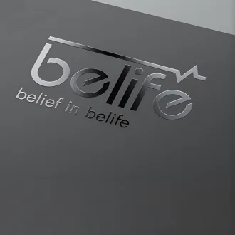
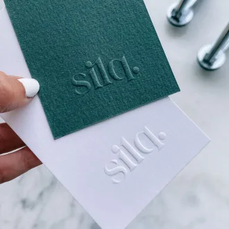
Combining bold color choices with tactile surface finishes elevates a simple cardboard box into a luxury brand package. Applying high-gloss Spot UV coatings over your logo or brand mascot creates a striking visual contrast against a smooth matte background. Incorporating metallic foil stamping or subtle paperboard embossing encourages physical interaction, tempting shoppers to pick up the box—a critical milestone in closing a retail sale.
Commit to Genuine Sustainability and Circular Packaging Materials
Environmental responsibility has shifted from an optional marketing bonus into a mandatory expectation for modern consumer brands. Today's buyers actively evaluate a brand's eco-friendly credentials before making purchasing decisions, often rejecting companies that rely on non-recyclable materials or excessive plastic packaging.
- Shifting to Recyclable Paperboard and Unbleached Kraft Stock
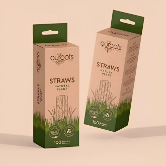
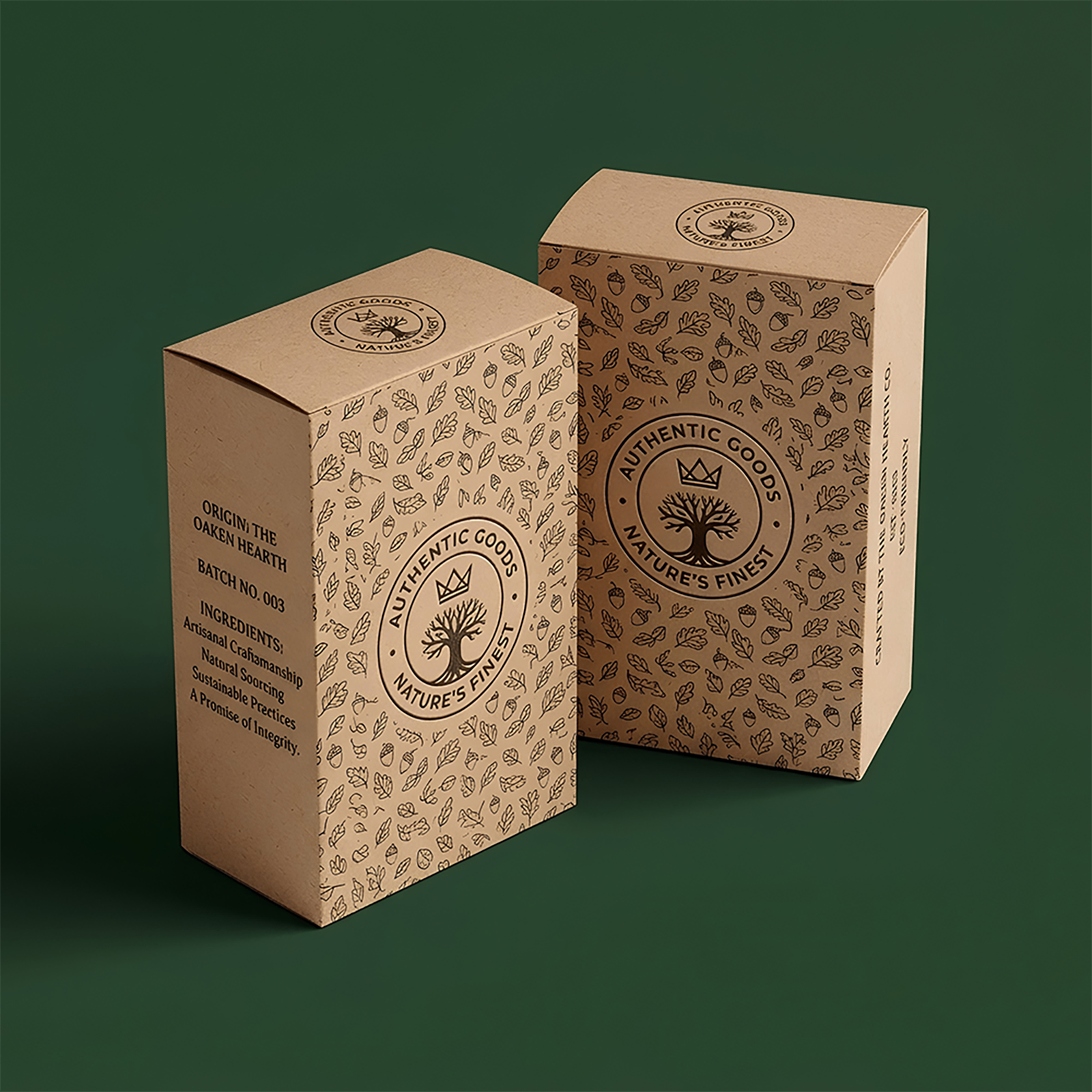
Replacing virgin wood-pulp paperboard with high-percentage post-consumer recycled (PCR) paperboard or natural, unbleached kraft stock dramatically lowers your environmental footprint. Sustainable paperboard materials are fully recyclable, compostable, and biodegradable. Displaying eco-friendly material certifications on your packaging builds immediate affinity with environmentally conscious consumers and aligns your business with global sustainability standards.
- Soy-Based Inks and Eco-Friendly Aqueous Coatings
True eco-friendly packaging extends beyond the paperboard base to include the inks and surface coatings used during printing. Standard petroleum-based inks emit volatile organic compounds (VOCs) and complicate the recycling process. Utilizing vegetable or soy-based inks alongside non-toxic, water-based (aqueous) coatings ensures your custom boxes remain completely food-safe, environmentally benign, and effortlessly recyclable.
Maximize Shelf Placement Through Strategic Box Dimensions
The physical proportions of your packaging play a critical role in how retailers display your product and how prominently it appears on the retail shelf. Structural dimensions must balance consumer convenience with store display standards to secure primary retail placement.
- Optimizing the Front Display Panel for Maximum Visual Real Estate
In retail packaging design, front-panel surface area is prime real estate. A box designed with a wider, taller front facing offers more visual impact than a deep, narrow box of the exact same internal volume. Expanding the front-facing dimensions ensures your brand name, logo, and artwork occupy maximum visual space on the grocery aisle shelf, effectively blocking out adjacent competitors.
- Standardizing Dimensions for Master Shipping Cartons
Efficient box dimensions also yield major logistics benefits behind the scenes. Designing your individual boxes to fit snugly inside standard wholesale corrugated shipping cartons without wasted air space lowers shipping costs, prevents crushed box corners during transit, and simplifies pallet stacking in wholesale warehouses.
Master Unboxing Experiences to Drive Social Media Amplification
Modern product packaging must perform exceptionally well both on retail store shelves and inside the consumer's home. In an era where user-generated content and unboxing videos drive immense organic marketing reach, designing an engaging internal opening experience creates valuable word-of-mouth promotion.
- Interior Printing and Surprising Custom Details
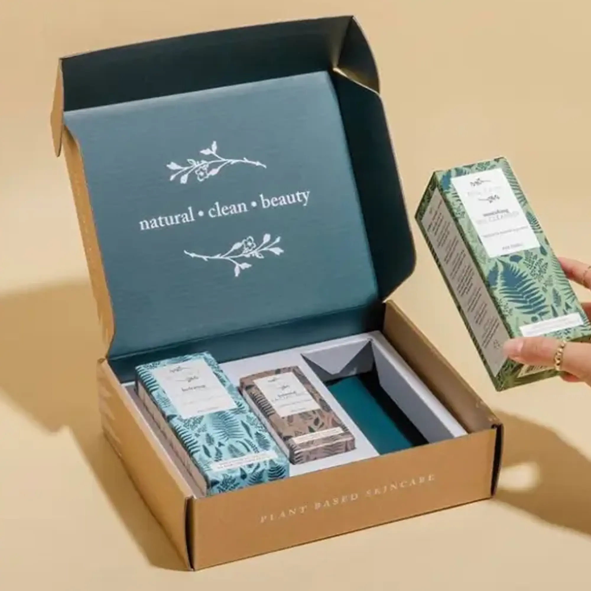
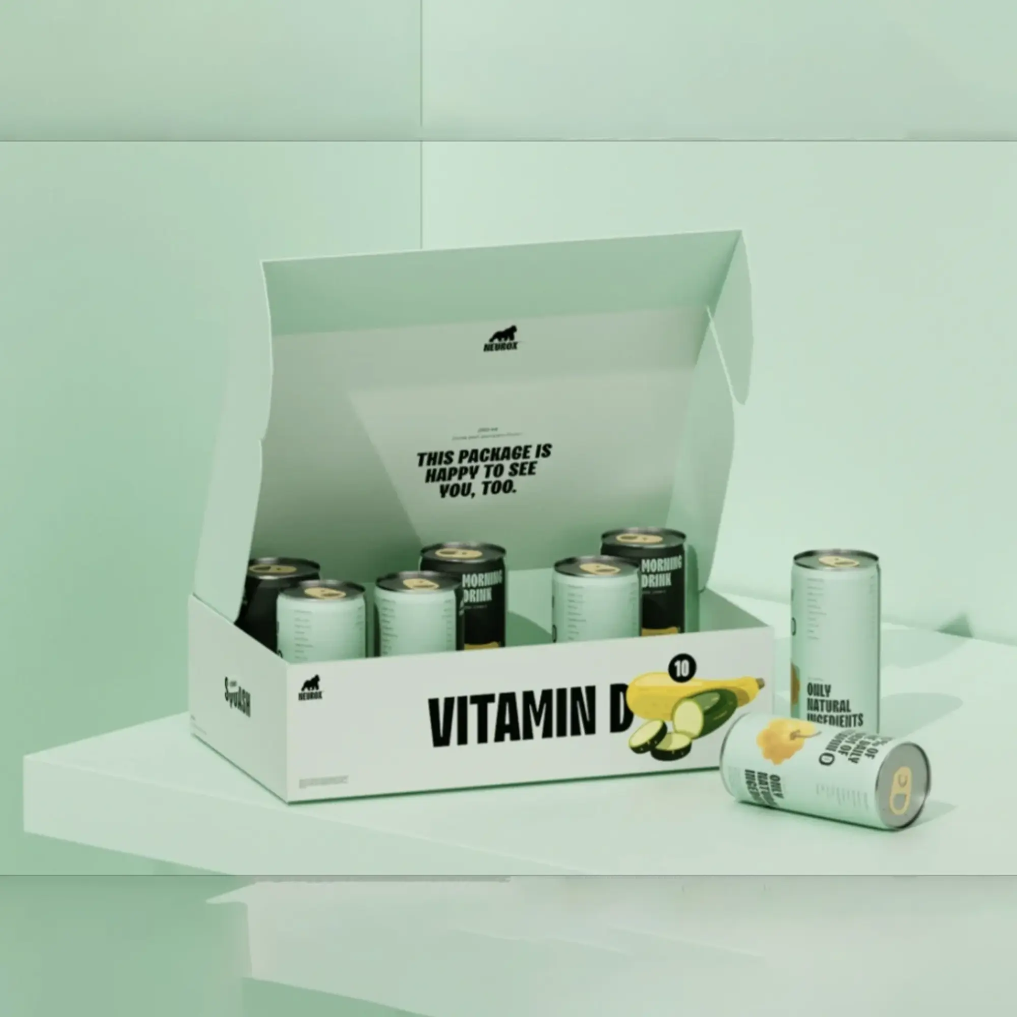
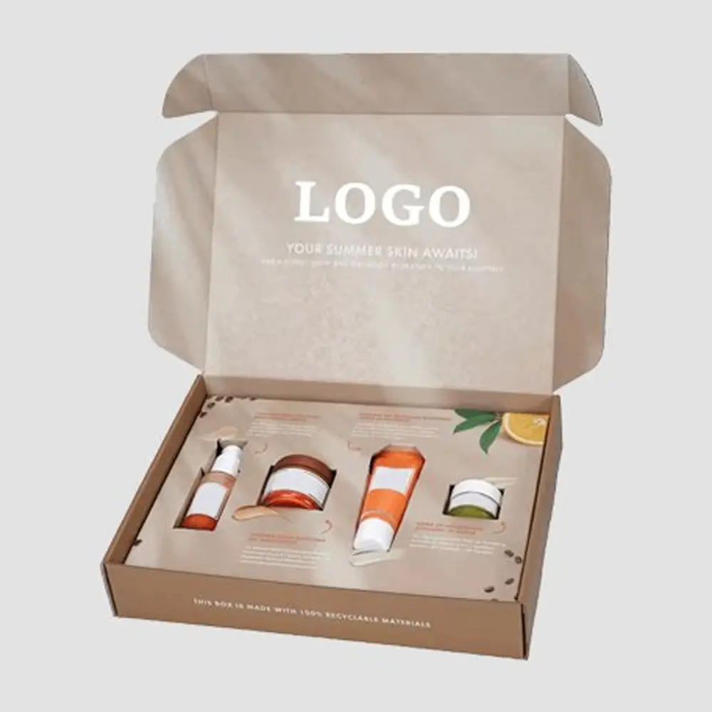
Extending artwork and messaging to the interior flaps and inner liner of the box turns an ordinary opening routine into a memorable experience. Printing cheerful morning quotes, fun trivia games, custom illustrations, or social media contest prompts inside the box delights consumers after the initial purchase, encouraging them to photograph or video their experience and share it online.
- Fostering Brand Loyalty and Social Sharing
A well-crafted unboxing experience transforms satisfied buyers into enthusiastic brand ambassadors. Small, thoughtful design touches—such as custom-printed inner bag seals, fun promotional messages, or collectible box art—foster long-term brand affinity and generate free organic exposure across social platforms.
Sourcing Wholesale Production and Material Optimization
To successfully execute a large-scale packaging overhaul while protecting profitability, food brands must carefully evaluate raw materials, printing technologies, and bulk manufacturing options. Ordering printed boxes wholesale allows growing businesses to secure significant cost-per-unit reductions, ensuring high-end design features remain financially viable across large volume production runs.
| Material / Finish Type |
Primary Structural Advantage |
Target Packaging Application |
Sustainability Rating |
| SBS Paperboard (Solid Bleached Sulfate) |
Ultra-smooth white printing surface offering maximum color accuracy and structural rigidity. |
Premium, retail-ready cereal packaging requiring rich, high-definition full-color graphics. |
100% Recyclable; sourced from certified sustainable forestry operations. |
| Natural Kraft Paperboard |
High tear resistance, distinctive organic brown appearance, and lightweight durability. |
Eco-friendly, organic, or health-focused cereal product lines. |
100% Biodegradable, compostable, and manufactured using high PCR content. |
| Corrugated E-Flute Stock |
Exceptional crush strength, impact cushioning, and structural stability. |
Bulk multi-packs, direct-to-consumer e-commerce shipments, and club store displays. |
Highly durable, easily recyclable, and ideal for reusability. |
| Aqueous & Matte Finishes |
Protects paperboard surfaces against moisture, scuff marks, and handling wear. |
Standard retail food box outer protective coating. |
Water-based, non-toxic, and fully repulpable in standard paper recycling streams. |
The Role of Professional Production Partners
Transitioning a packaging concept from initial graphic design files to finished, mass-produced boxes on retail shelves requires close technical collaboration with specialized packaging manufacturers. Professional packaging partners provide invaluable technical guidance regarding structural die-lines, ink tolerances, paperboard caliper selection, and food-grade compliance, ensuring that your finished boxes meet both aesthetic goals and practical performance demands.
When selecting a manufacturing partner for wholesale production, evaluate their technical capabilities in offset printing, digital short-runs, custom die-cutting, and automated folding-gluing processes. Choosing an experienced packaging supplier minimizes production errors, guarantees consistent color fidelity across multiple production runs, and keeps unit costs low through optimized manufacturing pipelines.
Conclusion: Transform Your Brand Identity Through Custom Box Excellence
The role of custom packaging extends far beyond basic food containment; it is a fundamental driver of brand identity, shelf presentation, consumer trust, and commercial growth. By adopting cutting-edge packaging innovations—such as interactive smart technology, vibrant color gradients, sustainable kraft paperboard, precision die-cut windows, and personalized demographic messaging—your brand can convert ordinary box surfaces into a high-performing marketing and sales channel.
Investing in superior paperboard materials, precise structural engineering, and compelling visual storytelling gives your products a decisive, durable competitive edge in crowded retail environments. Whether you are introducing an innovative new breakfast line or refreshing an established brand image, implementing modern packaging trends ensures your product line commands attention, drives retail conversions, and builds lasting customer loyalty for years to come.
Frequently Asked Questions About Custom Cereal Packaging
- How does custom cereal packaging boost brand sales and retail visibility?
Custom cereal packaging serves as a silent marketing tool that captures consumer attention in competitive retail aisles. By combining structural durability, vibrant colors, clear typography, and strategic visual hierarchy, tailored boxes communicate product value instantly, building consumer trust and driving impulse purchases.
- What are smart packaging technologies, and how are they used in cereal boxes?
Smart packaging incorporates digital tools like dynamic QR codes, NFC tags, and temperature-sensitive indicators directly onto the paperboard. These technologies allow shoppers to scan the box with a smartphone to access interactive recipes, farm-to-table sourcing data, loyalty rewards, or brand mini-games without cluttering the main artwork.
- Why are transparent die-cut windows effective on cereal packaging?
Transparent die-cut windows allow shoppers to see the actual cereal flakes, clusters, or dried fruits before purchasing. This visual transparency stimulates appetite, builds immediate trust in product freshness, and removes buyer hesitation compared to fully opaque boxes.
- How do sustainable materials improve cereal box packaging appeal?
Using recyclable paperboard, unbleached kraft stock, vegetable-based inks, and water-based coatings reduces environmental impact. Highlighting eco-friendly materials appeals to environmentally conscious buyers, strengthens brand reputation, and aligns your business with modern circular economy standards.
- What are the benefits of ordering printed cereal boxes wholesale?
Sourcing printed boxes wholesale significantly reduces unit production costs through economies of scale. Wholesale manufacturing allows food brands to utilize premium features—such as Spot UV finishes, custom die-cutting, and high-definition offset printing—while keeping overall packaging budgets optimized.

 Custom Boxes
 Mailer Boxes
 Shipping Boxes
 Display Boxes
 Product Boxes
 Retail Packaging
 Luxury Packaging
 Sustainable Packaging
 Mylar Bags
 Labels & Stickers
 Inserts & Dividers
 Acrylic Signs
 Mylar and Zipper Bags
 Cosmetic Boxes
 Custom Candle Packaging Boxes
 Food and Beverage
 Display Packaging
 Pharma Packaging
 Custom Blister Packaging
 Stand Up Displays
 Kraft Boxes
 Cereal Packaging Boxes
 Bakery Packaging Boxes
 Eco-Friendly Boxes
 Electronics Packaging Boxes
 Custom Vape Boxes & Packaging
 CBD Packaging Boxes
 Rigid & Luxury Packaging Boxes
 Gift Boxes
 Custom Soap Boxes & Packaging
 Metalized Boxes
 Retail Boxes
 Subscription Boxes
 Invitation Boxes
 Corrugated Shipping Boxes
 Matte Finish
 Gloss Finish
 Soft Touch
 Foil Stamping
 Spot UV
 Embossing
 Debossing
 Window Cutouts